|
3/23/2020 0 Comments Location Art: Ireland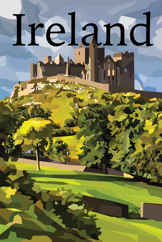 This is an illustration of Ireland's Rock of Cashel. The Rock of Cashel is in Tipperary and is one of Ireland's historical landmarks. The Rock of Cashel is almost 2000 years old, built in the 5th century. What a testament to how things were built for durability! My family originates from Ireland and most of them were farmers. For example, my great, great grandfather was a chicken and potato farmer in Ireland.
0 Comments
1/14/2020 0 Comments Abstract Artist Statement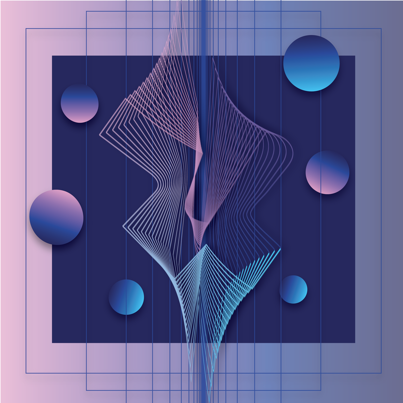 The title of this piece is Ambit and was created using Illustrator. Creating abstract art is quite difficult. This piece needed to be something, yet it can't be seen as anything. Therefore, concepts suit abstract art better (at least, in coming up with ideas that are abstract). I wanted to play with lines, objects, and gradients. Also, the gradients to play with light and dark colors. I wanted to tie in the differences with both the lines and the shapes with boxes and curves. This creates a unified picture despite it's differences. I also wanted to make this piece seem simple (ex: simple shapes: circles and squares) despite having much detail.
1/14/2020 0 Comments Ten ArtistsBefore I get started, I just want to announce that this post was originally posted back in August 2019. This is because Weebly glitched out, so I had to recreate the page.  "Lost Magic", the title of this piece, was taken and edited by Local Preacher on Behance.net. The juxtaposition of the white and colors on this photo really grabbed my attention!  Michael George Haddad created this piece, titled "Atlas Obscura" on Behance.net. I really enjoy the vintage feel and the creative placing of words in this piece. 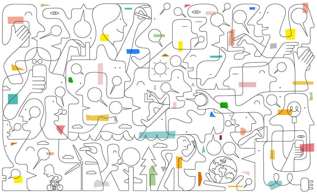 I really admire the creativeness and ease to Jonathan Calugi's art on Behance.net. This piece, titled "Line Lovers", is so simple, yet also busy.  This piece is in a collection called “Cats and Dogs” by Lola Dupre. This piece is a bit creepy and has an older style to it which makes it very stylized, but it is done in a way that is interesting and well done. 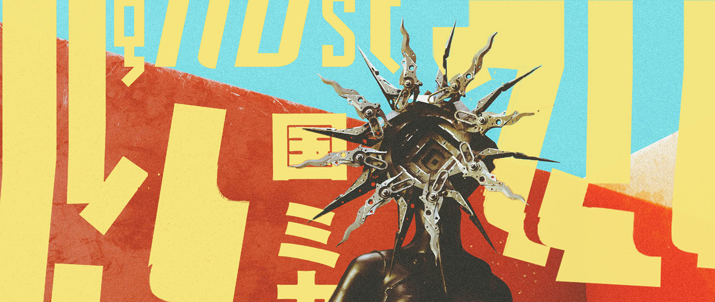 This is a piece from "Color Out of Space", a collection of art made by Maxim Goudin on behance.net. I immediately liked this piece due to the bright and colorful colors that played with each other. 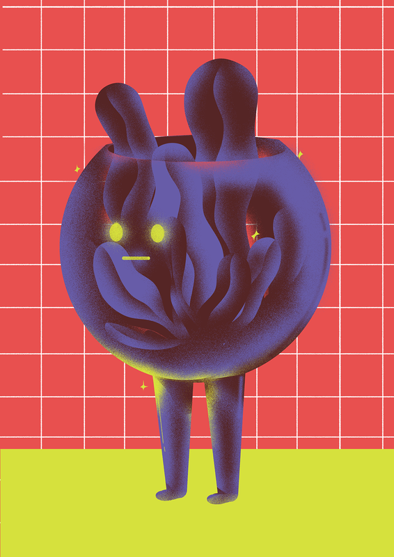 This is a piece from the collection titled "Weekly Illustrations Challenge PT.1" by Sandro Rybak. I also love this piece due to the creative colors that somehow make perfect sense with each other. The character is also really cute and creative. 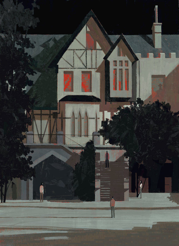 This is a piece in the collection titled, "Editorial III" by Katherine Lam. This piece looks like a painting with I love! I also like the use of colors for the lighting within the house which draws the attention to that area 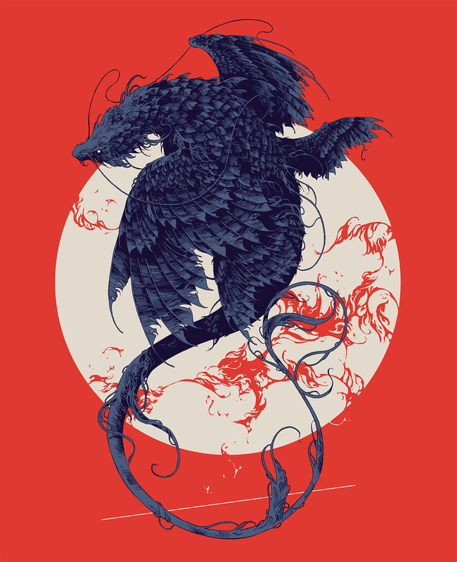 This is a piece in the collection titled, "Creatures III" by Ivan Belikov on Behance.net. The contrast between colors are very well done even with just 3 colors (this is what makes this piece very simple, despite the complexity of the creature  This is a piece in the collection titled, "Oxford VR" by Timo Kuilder. This piece is very pleasing to the eye as there are only three colors used with one pop of color (which makes this piece simple). Its also very cute! 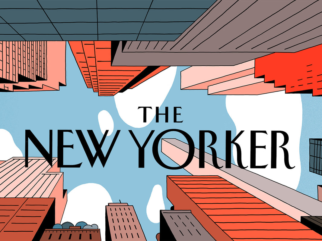 This piece, titled "The New Yorker - Web Banners", is made by Vincent Manhe on Behance.net. The colors of this piece makes it look older, which I love. I also love the simplicity of this design. 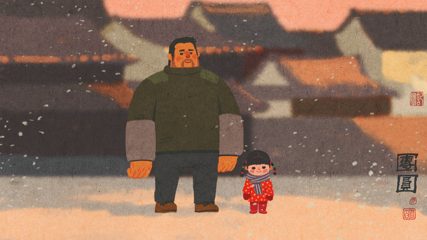 This piece, titled, "14.2, Tuan Yuan" by Zhang Jiming on Behance.net. This piece is just so cute and simple! I love the style of this piece too!
|
AuthorHello! My name is Moriah and I am currently a high school senior. ArchivesCategories |
Search by typing & pressing enter
 RSS Feed
